

Daily Burn is a digital subscription service offering streaming workouts and guidance to help members achieve their fitness goals.
Daily Burn’s product has constantly evolved to better serve its members and adapt to the ever-changing content. In a previous redesign, we created the Today page, a destination that gave members improved access to their program’s workouts, guidance, and nutrition content. Another large product initiative was 365, a live interactive workout show, which was new every day, and launched separately from the rest of the product.
Former Today page.
Former 365 page.
Existing problems
After having these two core product features around for a while, some problems became clear.
365 and the rest of the product were disjointed experiences.
Members who did one were not effectively exposed to the other — however, data showed that members who did both kinds of workouts were the most engaged. Extensive user feedback showed confusion on how one part of the product worked given what they knew about the other part.
The Today page was only useful to members following a single program.
Only a program being explicitly followed would show up in the Today page, so members doing workouts from more than one program, or 365, would not benefit at all from this hub.
So how did we successfully address these problems? For these projects I designed the new IA, the interactions and the navigation UI. I led my team into adapting these from the initial platforms (Web, iOS) into the rest of them (Android, Apple TV, FireTV and Roku), as well as guiding the creation of the new artwork needed.
Bridging the gap between 365 & the rest of the product
To allow members to more easily explore 365 from the rest of the app, and bring members who primarily did 365 to our other workouts, we redesigned the navigation to be the same for both parts of the product.
We explored using 365’s top navigation as the baseline with an overlay-on-expansion hamburger menu. However, this solution meant that the nav's links would be hidden by default, which would be counterproductive to bridging the gap. Another solution, navigation via browsing, was beyond the scope of these changes. Previous attempts at it had left us with a bunch of links and modules that didn’t get attention.

Unused iteration of 365 nav.
We then opted to iterate on the main app’s side navigation, which displayed all destinations by default. 365 can be experienced with video and chat simultaneously, so a sidenav eating into the horizontal space of users on laptop (which were a majority) could be detrimental. To address that, we made the sidenav collapsible, and then added its own first-use experience to teach members how to collapse it.
For the non-web platforms, we brought over this new IA that included 365.

Project: Homecoming
Next, we created a new Home page, to replace the Today page as the recurring landing place for all members. The Home page had to continue serving members with content from their program, while exposing them to 365 workouts and additional content from our now fast-expanding library. Each part of this page posed its own challenges which had to be solved holistically since this would be the centerpiece of the product in all apps.
Featured Carousel
The first challenge was the featured carousel. We wanted to display 365 workouts, normal workouts, and any other high-priority content. Until this point, members had never been exposed to 365 workouts in the same context as classic workouts. They were shown with different assets and metadata – so we had to design to unify how they were understood.
To solve this, we created different templates: Workouts, Classes (to display 365's upcoming and live states), and Content (which could be used for programs, announcements, and pretty much anything else). We worked with our graphic designer on new assets that would be needed for all existing and upcoming workouts.
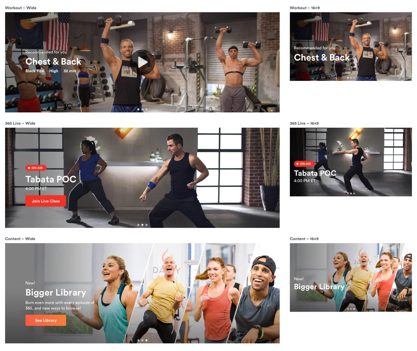
Featured carousel templates
All the different platforms, device sizes, orientations and fonts (which were not standardized between platforms) made this a particularly fun puzzle to solve.
After much brainstorming, we created universal breakpoints to be shared between Web, iOS and Android. For large formats we'd use a "Wide" image, and for smaller ones we'd use 16:9, which we had readily available for all workouts. The templates were designed using nested Sketch symbols to keep elements consistent without going insane.

Featured carousel template Sketch symbols
Content Rows and Cards
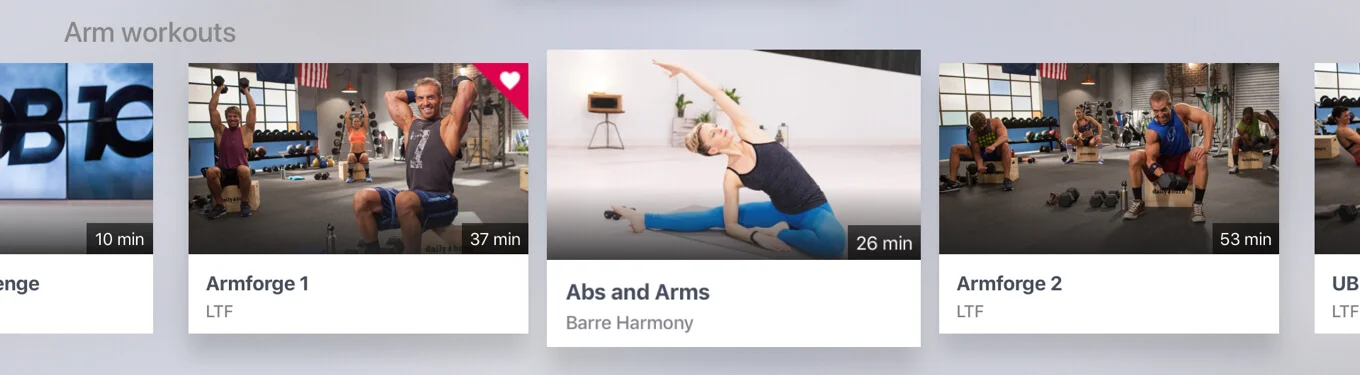
The second part of the Home page was the content rows. These required redesigning the workout cards (thumbnails), which affected many other pages, and addressing layout and interface concerns in all apps. Before this redesign we still had legacy cards in portrait and square formats in different apps. Changing all of them to a new, unified format was a scope increase we gladly accepted since it would mean simplifying a lot for the future.
We also had to work with the back end devs to determine what content would populate the rows and what member actions would affect that. This implied not just creating new specs, but many conversations to understand how old features worked already.

New cards & empty row

New Home page on tvOS
New cards on tvOS
Outcome
Changing the nav and launching the Home page were two massive endeavors that significantly changed all our platforms for the better.
- We made our product easier to use and understand – which decreased Customer Support cases related to confusion around these features.
- Saw an increase in videos started (engagement!).
- Greatly simplified how our content was presented across different features and platforms – helping members, simplifying our workflow and settling a lot of tech debt.
- Created a reliable and consistent channel for communicating with our members.
- These changes created future proof features that served as scalable solutions for further improvements.