

The RegTech for Regulators Accelerator (R2A) partners with leading financial sector authorities to pioneer the next generation of tools and techniques for market supervision and policy analysis.
Over a few months I worked with the Deputy Director of Inclusive Fintech and his team in designing a public facing interface of a database of tech vendors. The objective of the tool is to allow their clients, financial regulators from all over the world, to find vendors that can help with their objectives.
Challenges
Target users would have different levels of context and knowledge
R2A offers workshops and guidance to regulators using existing and adaptable materials. The context and knowledge they’d have of the tool could vary greatly; the same would apply for technology in general. They could have attended a workshop, had a team member or leader participate in a workshop and then involve them, or learned about the tool in a different way and had no additional involvement with R2A’s material.
Reliance on internal testing
Due to the nature of their relationship with their partners and the project, we couldn’t approach our target users with prototypes to test the clarity and usefulness of the experience. Our target was such a small group that we couldn’t recruit externally either.
Outlining the flow
To design the tool, I parted from a chart created by R2A’s team that had been pre-approved by their stakeholders. The chart described the following steps:

After some brief exploration and discussion, I proposed some changes so we could better serve our all our target users:
Focus only on the Regulator role since the other roles were not served by the database.
Replacing Focus Areas with Objectives. The latter would be easier for users to understand, and we could still display Focus Areas as secondary data within the Objectives. In addition, forcing users to single select a Focus Area would show an incomplete view of the Use cases, since some of them may apply to multiple areas.
Define what happens when someone selects a vendor, as this was unclear.
Expose the full list of vendors right from the intro, for repeat visitors.

Version One
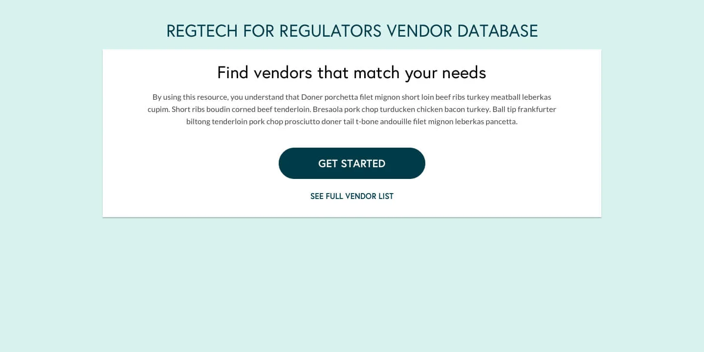
Intro

Objective
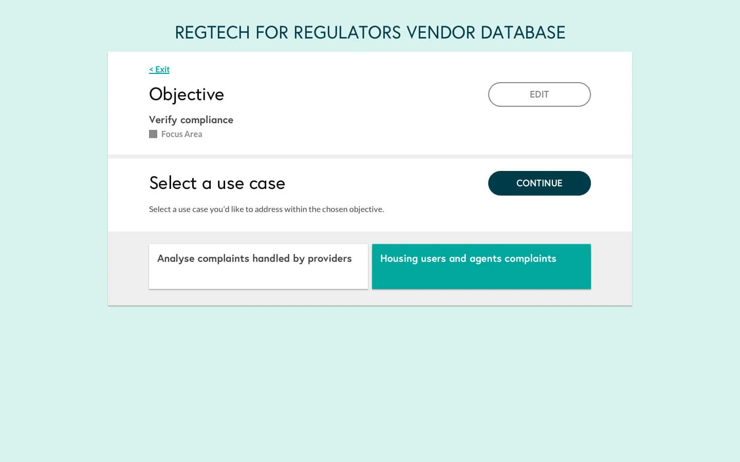
Use Case

Vendors
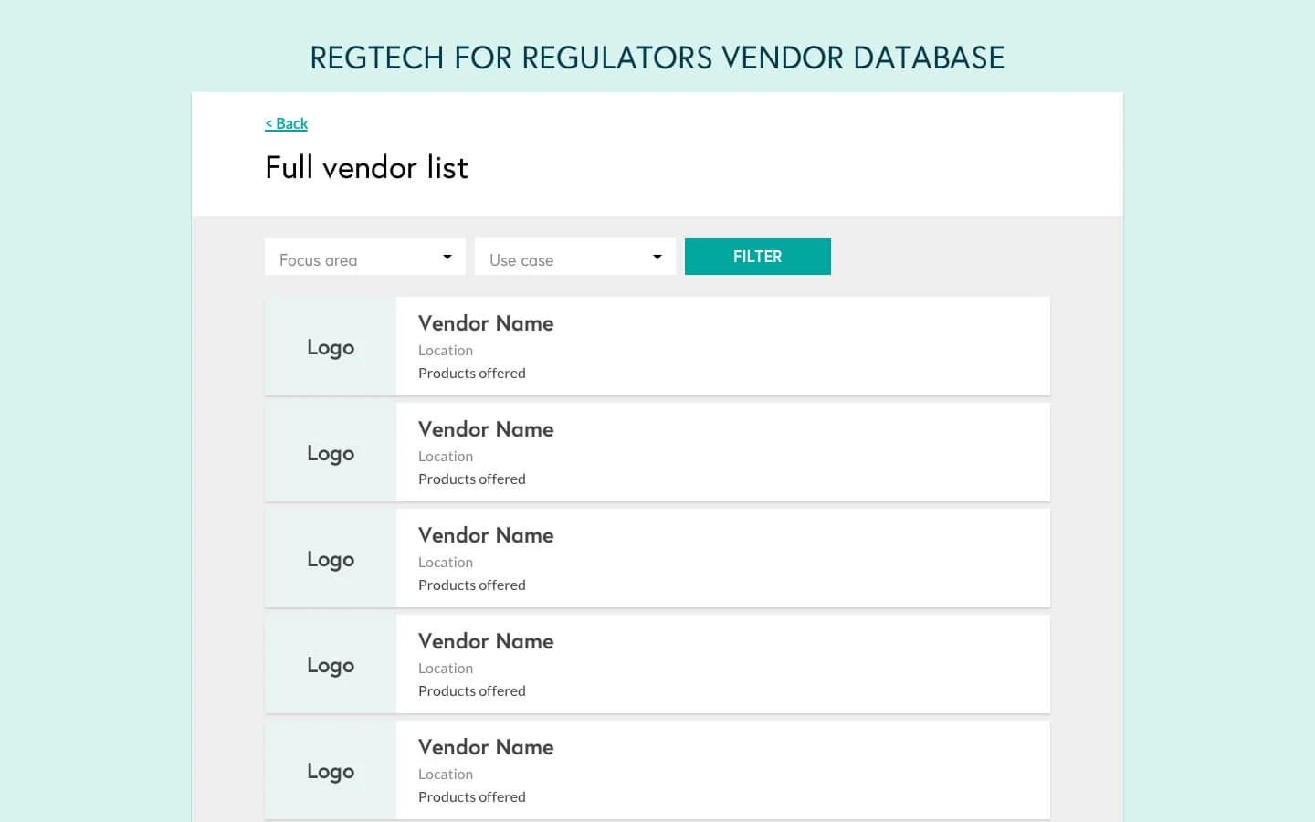
Full Vendor List

Info & Contact
Learnings
I created this first pass of the interface with some visual input from stakeholders. I provided a style guide and prototyped some of the interactions to assist the front end implementation. We sent this as a web prototype to the involved team for feedback. These were our learnings:
Users didn’t know how long or complicated the tool was before starting.
This created friction because some testers thought the experience would be daunting.The list of objectives was too long.
Grouping them by focus area helped, but if an objective matched 3 focus areas our grouping would break.Users couldn’t find the link to the external guide.
This was our failsafe for all users who were unfamiliar with the concepts taught in the R2A workshops or who needed a refresher.There was no reason to double confirm steps.
We provided no further information after selecting something, so forcing users to manually continue was unnecessary.Use Cases were not providing value or guidance.
After integrating the data, we found that Use Cases were not creating any meaningful difference in the vendor results. It was forcing users to self-select for differences that we could include in the Objective description.
Version Two

Intro
Objective
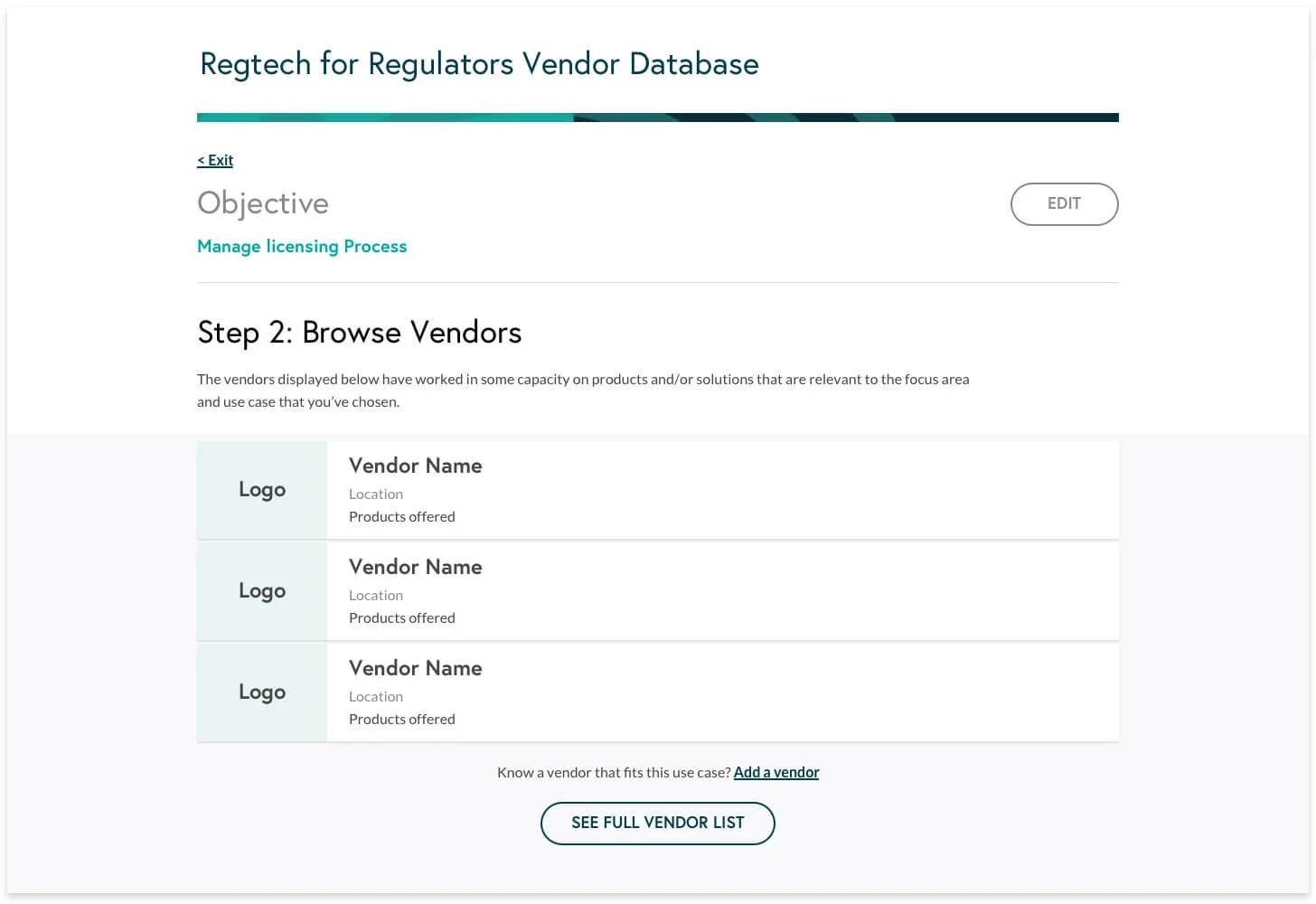
Vendors
To address the learnings from V1, I made the following changes:
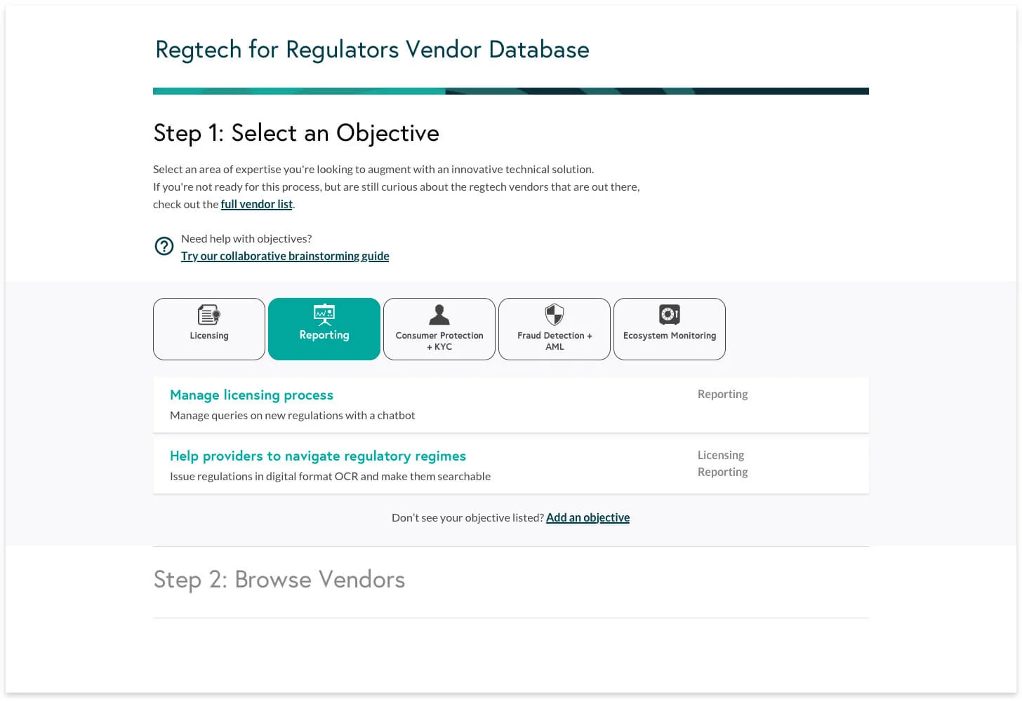
- Expose the steps at all points, even before starting.
- Make the link to the guide more noticeable.
- Add Focus Area filters to narrow down the list of Objectives.
- Remove the double confirmation – single select now moves the user to the next step.
- Remove the Use Case step.
We also added UI to allow users to suggest objectives and vendors.
Version Two is currently in testing with a larger internal group.