
Daily Burn is a digital subscription service offering streaming workouts and guidance to help members achieve their fitness goals.
During my years at Daily Burn no feature was so polarizing or hotly debated as the Program Schedule. This feature, which had always been a part of programs, was designed to guide users on which workouts to do and what order to follow, to complete a workout program.
The business metrics the product team focused on were engagement and retention. Getting more users to follow and complete their programs would directly benefit these metrics.
In this post I’ll cover how we achieved this by redesigning the program schedule, addressed several user problems, and improved one of the core experiences of the product. My role in this project included leading the product design team, quantitative user research, stakeholder management, and UI design.
The previous schedule
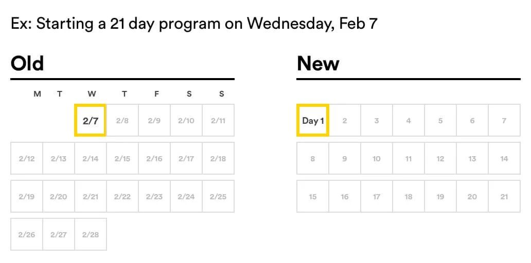
To explain the changes we made, I’ll describe how the program schedule worked at the time. One fundamental difference between our workout programs and, for example, a TV show, is that in a workout program a user may have to complete the same workout multiple times, sometimes even within the same week.
Each program had a schedule that followed these rules:
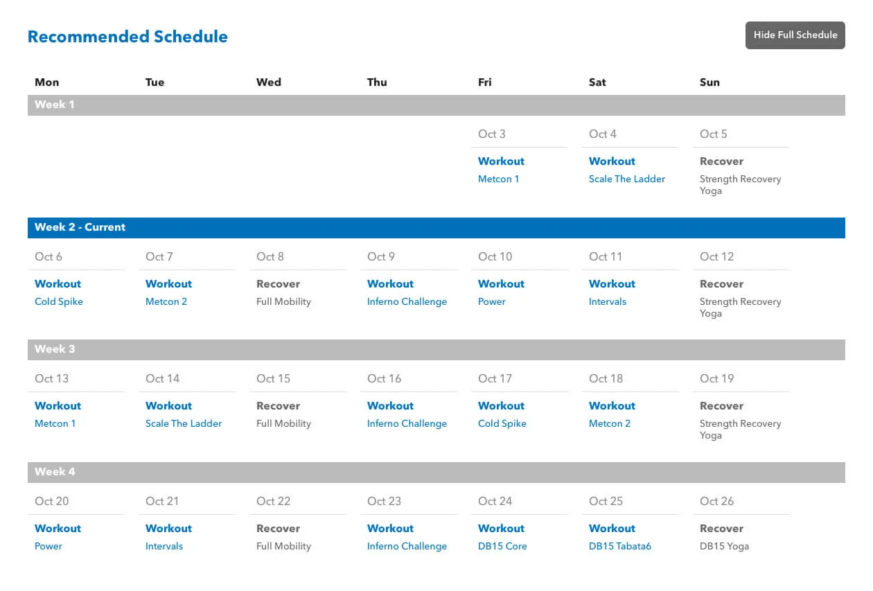
Every day of a schedule had a workout or recovery video assigned to it. The schedule would populate calendar dates based on the day the user started the program.
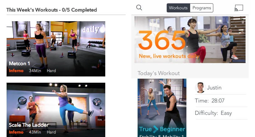
Only the workouts for the current week, Monday through Sunday, were shown a row on the Home page.
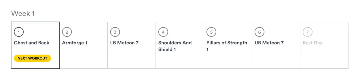
The next-in-scheduled-order, not-completed workout would be shown as “Next Workout”, but only in the Home page’s carousel.
Workout completions were only tracked for the current week, and only on the Home page, not on the program schedule page. Users could complete their workouts for the week in any order.
Since it was tied to calendar dates, the program schedule would auto-advance to the next week every Monday – whether the workouts for the previous week had been completed or not.
There was no way to pause or skip, the only possibility was to restart from Day 1.
Previous schedule, introduced circa 2014.
Existing problems
This version of the schedule had been around for years, and we had a trove of customer feedback, complaints, and feature requests about it. These were the most salient problems, and the ones we decided to tackle with this redesign:
The “next” workout to do is unclear.
“I can't seem to find what the next workout of my program is.”
The schedule progresses independently of workout completion.
Completion is not tracked for the whole program.
“I wish I could see the workouts completed in each week.”
The schedule is only available on desktop web.
“Where can I find the workout schedule of what workout needs to be done on a daily basis?” (iPhone user).
Program Schedule UIs on old versions of Home pages.
It was also important to consider what the schedule already did well, to prevent breaking what was working. We decided the most important things to keep were:
- Allow for completion of workouts out of order.
- Not allow users to get stuck in a workout they didn’t like, or couldn’t do.
The new and improved schedule
Having agreed on what we wanted to fix from the existing schedule, we got to work on solutions. While the product team was in agreement about these, we had to convince stakeholders and members of the dev team – many of who had historically been opposed to tracking progress in the schedule.
Besides fixing existing issues, one of our most important goals was to make the new schedule a great and self-explanatory experience for new users.
These were the solutions we designed to make a better schedule:
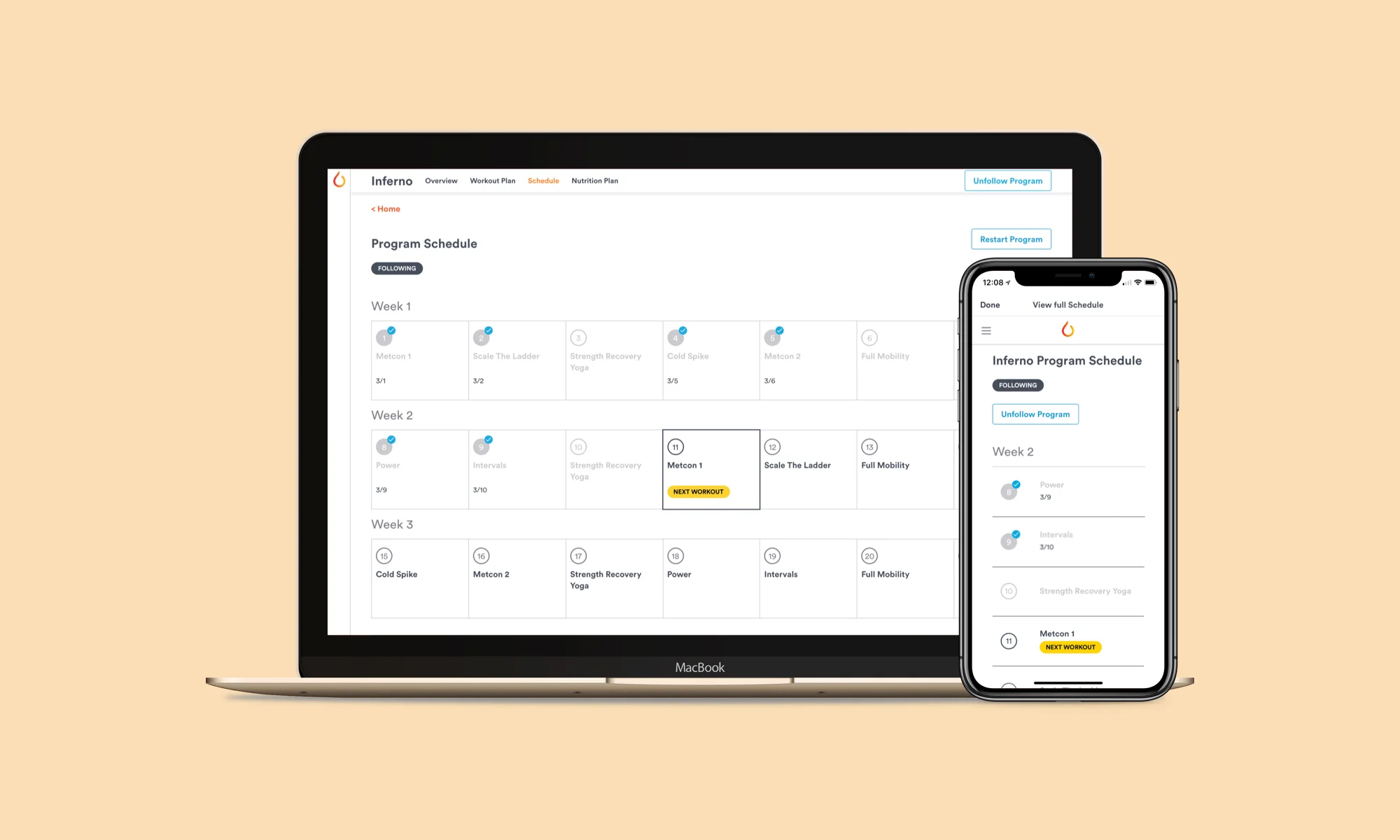
Communicate the correct “Next” workout.
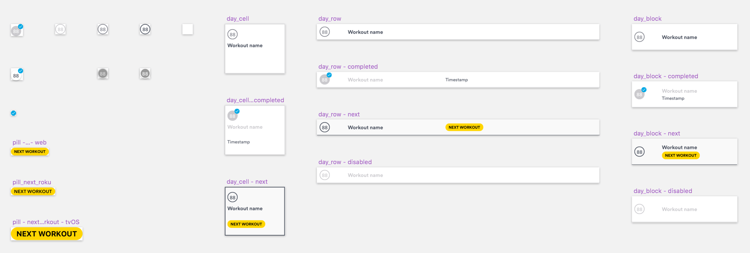
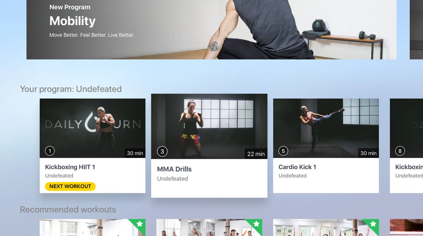
Since the goal of the program schedule was guidance, we worked on making the specific workout marked as next very clear with both language and visuals. We also knew this had to be reflected in all instances where users interacted with their schedule.

Home page's feature carousel & program schedule row
Schedule UI on Program detail page
Make the schedule easy to follow.
We changed the schedule’s behavior so it would only forward when a workout is completed. To make this possible, we removed calendar dates and replaced them with sequential numbers. However, to preserve the existing mental model of how users thought about their fitness, we kept workouts grouped into weeks.
Make the schedule flexible.
By making the schedule only move forward with completions, we introduced an issue that the previous schedule solved for: users could get stuck with a workout they didn’t like, or couldn’t do, as their next workout.
To solve this, we introduced the ability to skip forwards and backwards. This also meant introducing the concept of a “skipped” workout, which had to look different than completed. This allowed us to address another pain point: the ability to go back a controlled amount of days – for those resuming after a vacation or wanting to improve a specific week.

Show completed workouts in the program
Besides showing workout completion in the Home row, the new schedule would also keep track of completions in the schedule page – and persist completions throughout the program.
Since we didn’t have a universal workout history, we also showed the dates each workout was completed.

Schedule UI sketch symbols
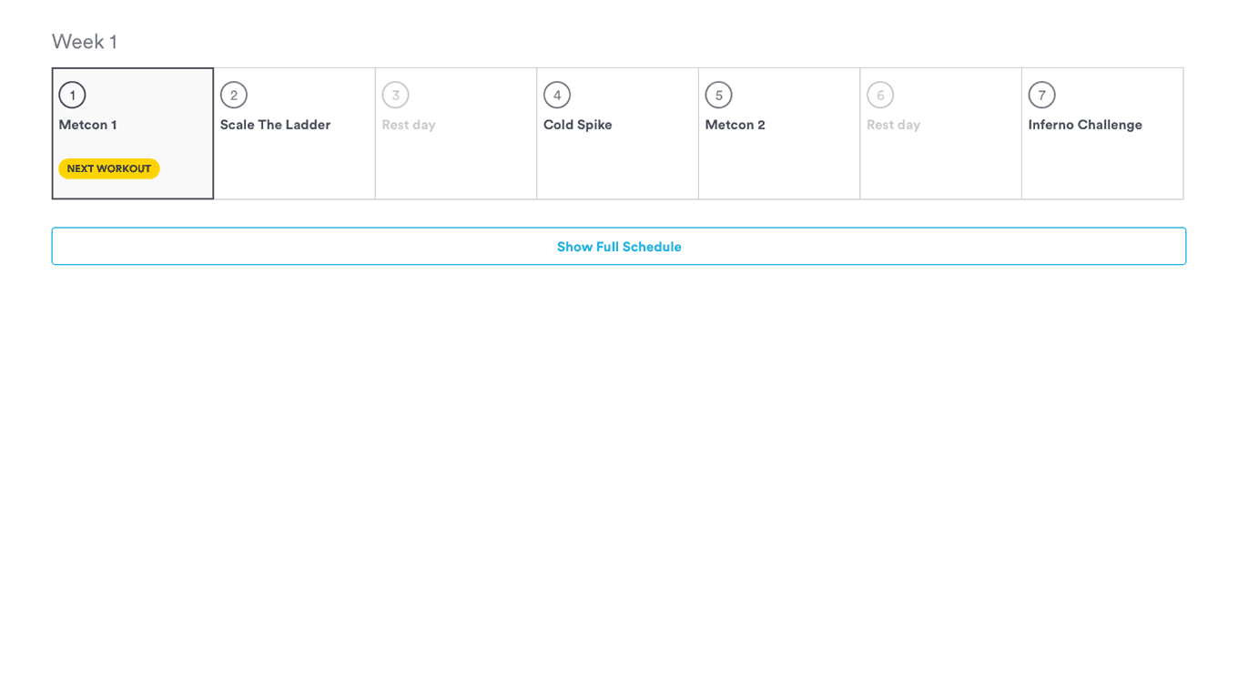
Schedule UI on Program detail page
Make the schedule available everywhere
Well, not really everywhere. But the new schedule was designed to be responsive which allowed us to add it as web view in our iOS and Android apps. Also, the improved Home row provided enough information to make the schedule useful on all platforms, including TV.
Once I had completed the UI the Home row cards and the full schedule for Web, I led my team into translating them for all our other platforms.

Schedule UI in medium and small layouts
Program row on tvOS
Migrating to the new schedule
At the time we made this schedule redesign, all users had to follow a program at all times. This meant when we launched the changes every single user’s schedule would look and behave differently than before.
We considered rolling the schedule out as an opt-in, but this would mean a nightmare for Customer Support and a very slow process to eventually consolidate everyone. We were confident we were solving the problems, so we decided to do move everyone in a single migration.
With help of the back end devs, we explored how to best position users in the new schedule. They’d be moving from calendar dates to sequential numbers, and from having to track completions on their own to seeing our version of their progress. We got to a conclusion that settled users into the new schedule while erring on the side of “more workouts completed”.
More importantly, we painstakingly wrote a post for our users that explained:
- What we were changing and why.
- How the new schedule would work.
- How their current progress would be affected, and their place in the new schedule calculated.
- How to change their next schedule themselves – important if we guessed wrong.

Schedule demo for announcement
Outcome
The results from launching the new schedule were pleasantly surprising: a huge success!!
Users were extremely happy to have been listened to and loved the improvements. They wrote in to tell us, which felt great:
"As someone who has pestered you all to add this feature I just wanted to say, AMAZING JOB GUYS!!!! YOU'RE THE BEST!"
"Good job! That change was much needed."
"Thank you for the continued refinements!"
- We had a handful of users who were unhappy having lost the calendar dates that they were accustomed to, but this was an acceptable trade for us.
All the existing problems we tackled were eliminated. Customer Support labels for schedule issues decreased by nearly 100% – new users never had to deal from these problems either.
A known issue became much more noticeable and annoying: missed completions. Many users now wrote in claiming workouts they had done were not marked as complete – which we’ve yet to address.
More users engaged and followed along their programs. The “Your Program” row on the Home page became the source of most workouts played (by a large margin), with the “Next Workout” being the most commonly played.